Flat solid colors are no longer enough. In 2026, the world's most impressive websites — from Stripe and Linear to Apple and Figma — all use rich, multi-color CSS gradients to create depth, visual interest, and premium aesthetics. The good news? Gradients are pure CSS: zero extra HTTP requests, zero performance cost, and infinite creative possibilities.
In this comprehensive guide, we'll cover all three types of CSS gradients with real code examples you can copy right now — plus show you how to design them visually in seconds using our free tool.
Type 1: Linear Gradients
The most popular type. Colors transition along a straight line at an angle you control — from 0° (bottom to top) to 360°. Here are live examples:
/* Diagonal tricolor gradient (135°) */
background: linear-gradient(135deg, #12c2e9, #c471ed, #f64f59);
/* Deep ocean dark gradient (left to right) */
background: linear-gradient(90deg, #0f2027, #203a43, #2c5364);/* Sunset gradient (top to bottom) */
background: linear-gradient(180deg, #fc466b, #3f5efb);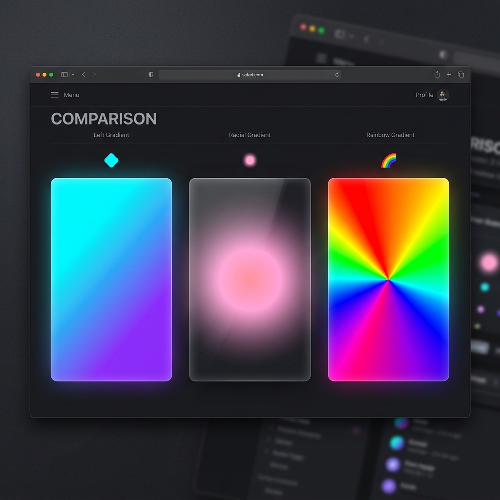
Above: Linear gradient (left), Radial gradient (center), and Conic gradient (right)
Type 2: Radial Gradients
Colors radiate outward from a central point — like a glowing orb, a sunburst, or a spotlight effect. Perfect for glassmorphism card backgrounds and drawing the user's eye to a focal point.
/* Glowing orb effect */
background: radial-gradient(circle, #f953c6, #b91d73);
/* Ambient corner glow (great for dark UI cards) */
background: radial-gradient(ellipse at top left, rgba(41,171,226,0.6) 0%, transparent 60%), #0a0a1a;Type 3: Conic Gradients
The newest type. Colors rotate around a center point like a color wheel. Great for pie charts, loading spinners, and modern abstract backgrounds.
/* Full color wheel with conic gradient */
background: conic-gradient(from 0deg, red, yellow, lime, aqua, blue, magenta, red);
Practical Real-World Use Cases
| Use Case | Best Gradient Type | Example Application |
|---|---|---|
| Hero section background | Linear (diagonal) | Full-page colorful banner |
| CTA buttons | Linear (left to right) | Brand gradient on hover |
| Glassmorphism cards | Radial (corner glow) | Ambient light behind card |
| Text color effect | Linear (any angle) | Gradient clipped to text |
| Progress bars | Linear | Animated fill indicator |
| Decorative orbs | Radial | Background ambient glow |
Applying a Gradient to Text
One of the most popular modern design trends — gradient-colored text. Here is the exact CSS code to achieve it:
h1 {
  background: linear-gradient(135deg, #29abe2, #ec4899);
  -webkit-background-clip: text;
  -webkit-text-fill-color: transparent;
  background-clip: text;
}
This text uses a CSS gradient!
🎨 Design Gradients Visually — No Code Required
Why guess at HEX codes and angles? Our Free CSS Gradient Generator lets you design any gradient visually with color pickers and a live angle dial. Hit Randomize for instant inspiration, then copy the code with one click.
Open CSS Gradient Generator →Step-by-Step: How to Use the Gradient Generator
Linear or Radial?
Use the dropdown at the top of the controls panel to select "Linear Gradient" or "Radial Gradient". For most hero backgrounds and buttons, start with Linear. For ambient glows and glassmorphism effects, use Radial.
Pick with Native Color Pickers
Click either color swatch to open your OS's native color picker. Or paste your exact brand HEX code (e.g., #29abe2) directly into the text input next to each swatch for pixel-perfect brand accuracy.
Drag the Angle Slider
For linear gradients, drag the angle slider from 0° to 360°. Watch the large preview box update in real-time. Tip: 135° is the most popular "premium" diagonal angle used by top brands like Stripe.
Click 🔀 Randomize
Experiencing designer's block? Click the Randomize button to instantly generate a beautiful, curated random gradient combination. Thousands of combinations are possible — keep clicking until you see the perfect one.
One Click to Clipboard
The code box below the preview automatically generates cross-browser CSS including a solid color fallback. Click "Copy CSS Code" and paste directly into your stylesheet — done!
Frequently Asked Questions
Do CSS gradients work in all browsers?
Yes. Linear and radial gradients have had near-universal browser support since 2013. Conic gradients are supported in all modern browsers (Chrome 69+, Firefox 83+, Safari 12.1+). No vendor prefixes needed for standard gradients in 2026.
Can I add more than 2 colors to a gradient?
Absolutely! CSS gradients support unlimited color stops. Just add them comma-separated: linear-gradient(90deg, red, orange, yellow, green, blue). You can also control the position of each stop by adding a percentage: linear-gradient(90deg, red 0%, blue 40%, green 100%).
How do I animate a gradient?
CSS cannot directly animate gradient values (since they are background images, not colors). The trick is to use background-size animation instead: set the gradient to be 200% wide and animate the background-position with a CSS keyframe animation to create a flowing "shimmer" effect.